The Elm Estate
A lush green enclave in downtown Reno, The Elm Estate is a versatile event venue combining rich history, modern elegance, and all-inclusive hospitality.
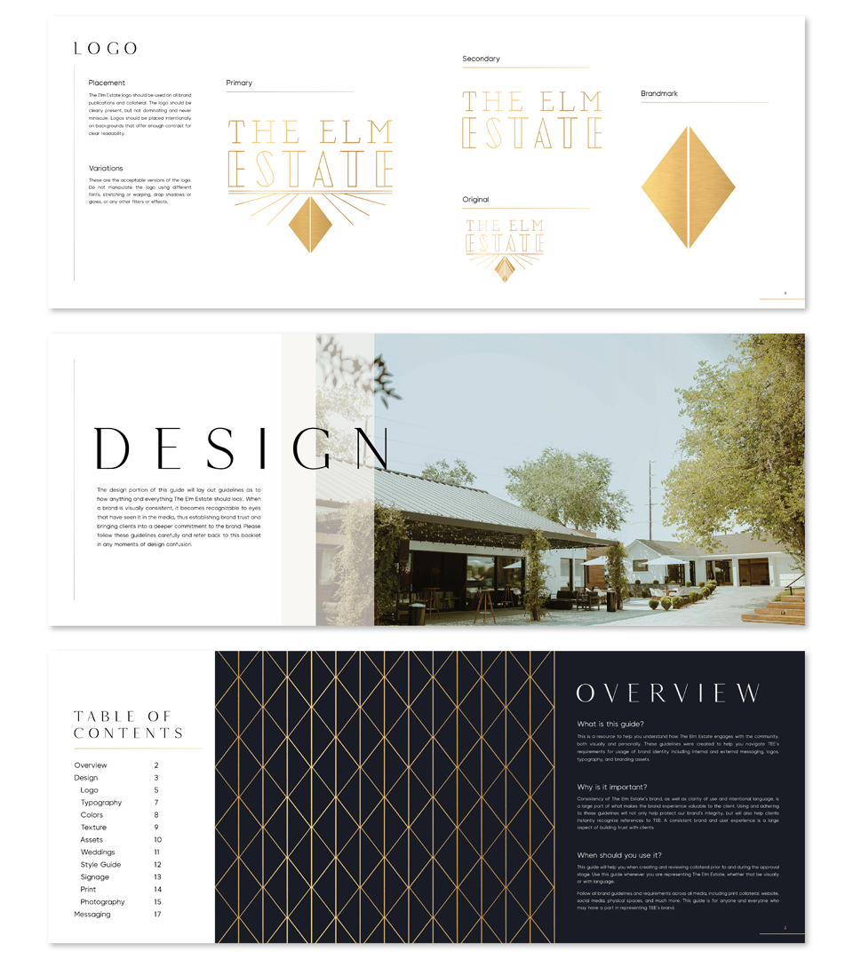
Logo Design
We designed the logo to be simple at first glance and more intricate upon further inspection. While the font is easy to read, it communicates sophistication. A viewer might think there is no graphic design and the logo is simply typography, but the letters actually form a table, which works to ground the design.
Brand Guide
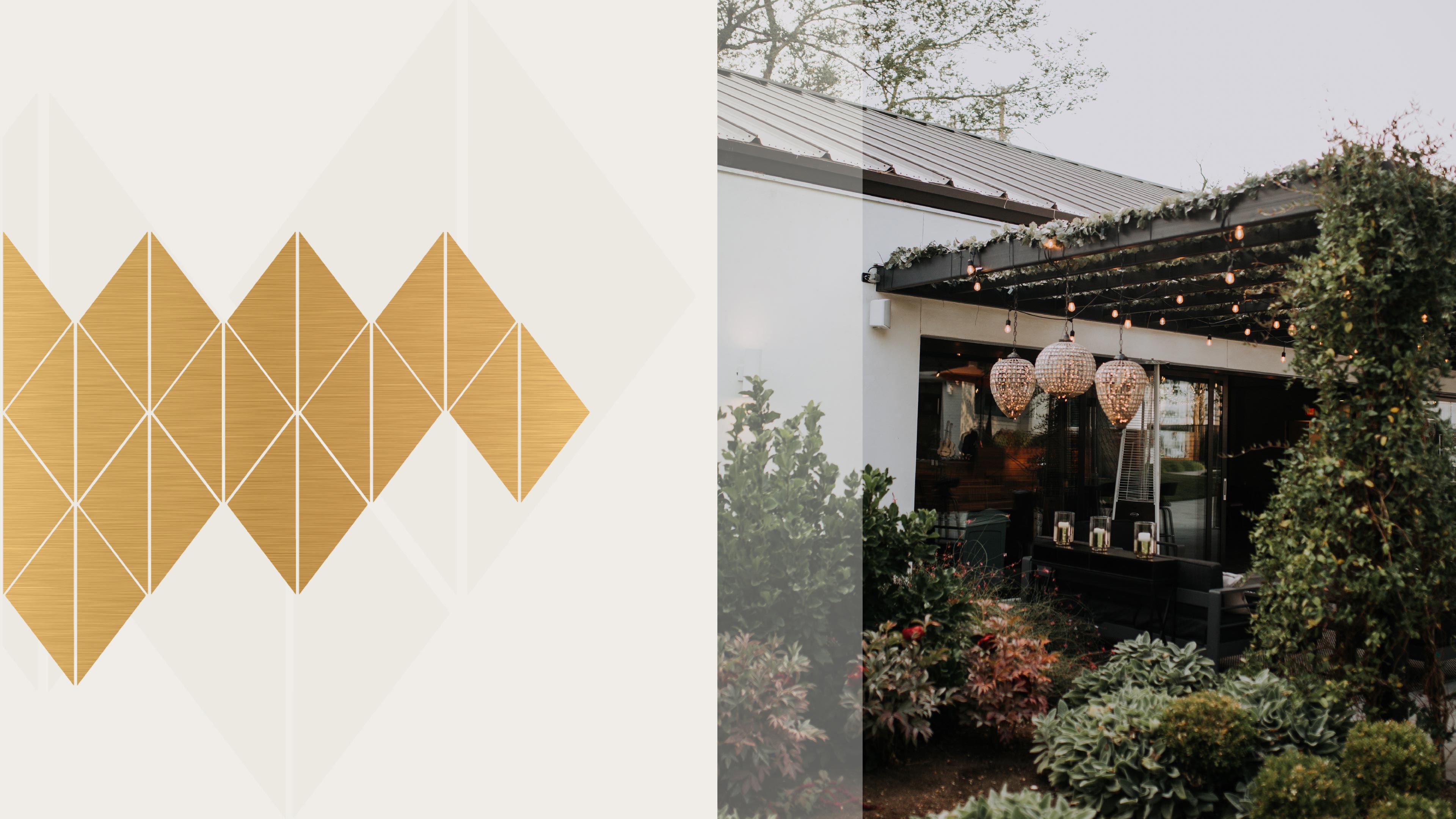
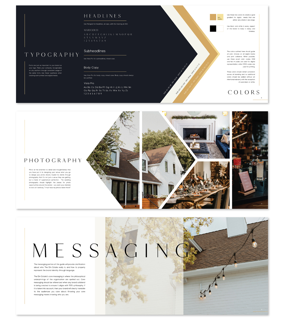
Geometric shapes, onsite photography, and refreshed messaging are key features of The Elm Estate’s brand guide. They have been able to use their brand elements and guidelines to run effective advertising campaigns.
“Rich history, modern design”
Messaging
The Elm Estate needed messaging that expresses their multifaceted venue, their attentive service, and their dedicated event planning. We incorporated one-liners and descriptions that convey their rich history and modern amenities.

Photography
When it comes to researching event venues, high-quality photography is crucial for leading people to book. We captured the beauty of The Elm Estate’s property, as well as special events so their audience can visualize what their special day will look like.


Videography

Web Design & Development
The Elm Estate’s website is photography rich, easy to navigate and offers a detailed look at their services and onsite lodging. With clear calls to action and SEO optimization, the Elm Estate has seen a boost in bookings.