Nevada Youth Soccer Association
When NYSA tapped us for a branding and website revamp, it was like hitting the winning shot in our own game. We’re all about championing local endeavors! Honoring their existing brand equity, we revitalized their logo, streamlined their branding and messaging into a user-friendly guide, and seamlessly integrated these elements into a tailor-made WordPress website. And as for snapping some sports photography? We dove right into the action without hesitation.
Logo Design
NYSA’s logo combines navy blue, a characteristic Nevada color, with a bright green reminiscent of a soccer field. The flowing lines with the soccer ball provide movement.
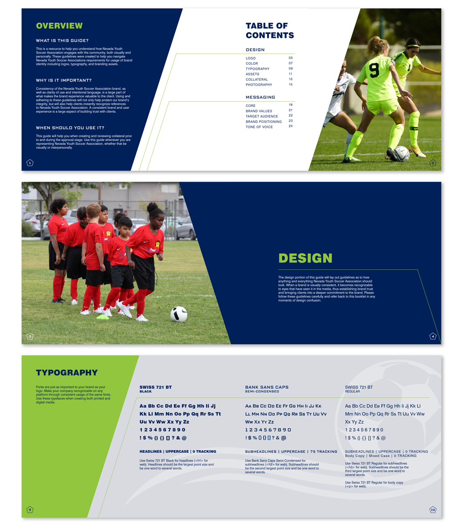
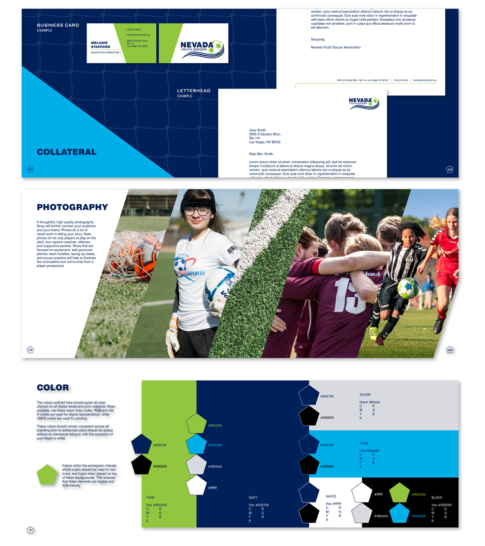
Brand Guide
NYSA serves players, coaches, and parents across the state of Nevada, and relies on consistent brand recognition. We designed a brand guide with custom assets, unified colors/fonts, and core messaging that enable NYSA to present a consistent visual and conceptual presence.
"NYSA exists to promote teamwork, personal development, and fitness in soccer players ages 4-18."
Messaging
We helped NYSA clarify their core identity, mission, vision, values, and more. Their messaging is geared towards a broad audience with little to no familiarity with soccer, so the messaging speaks to this audience.

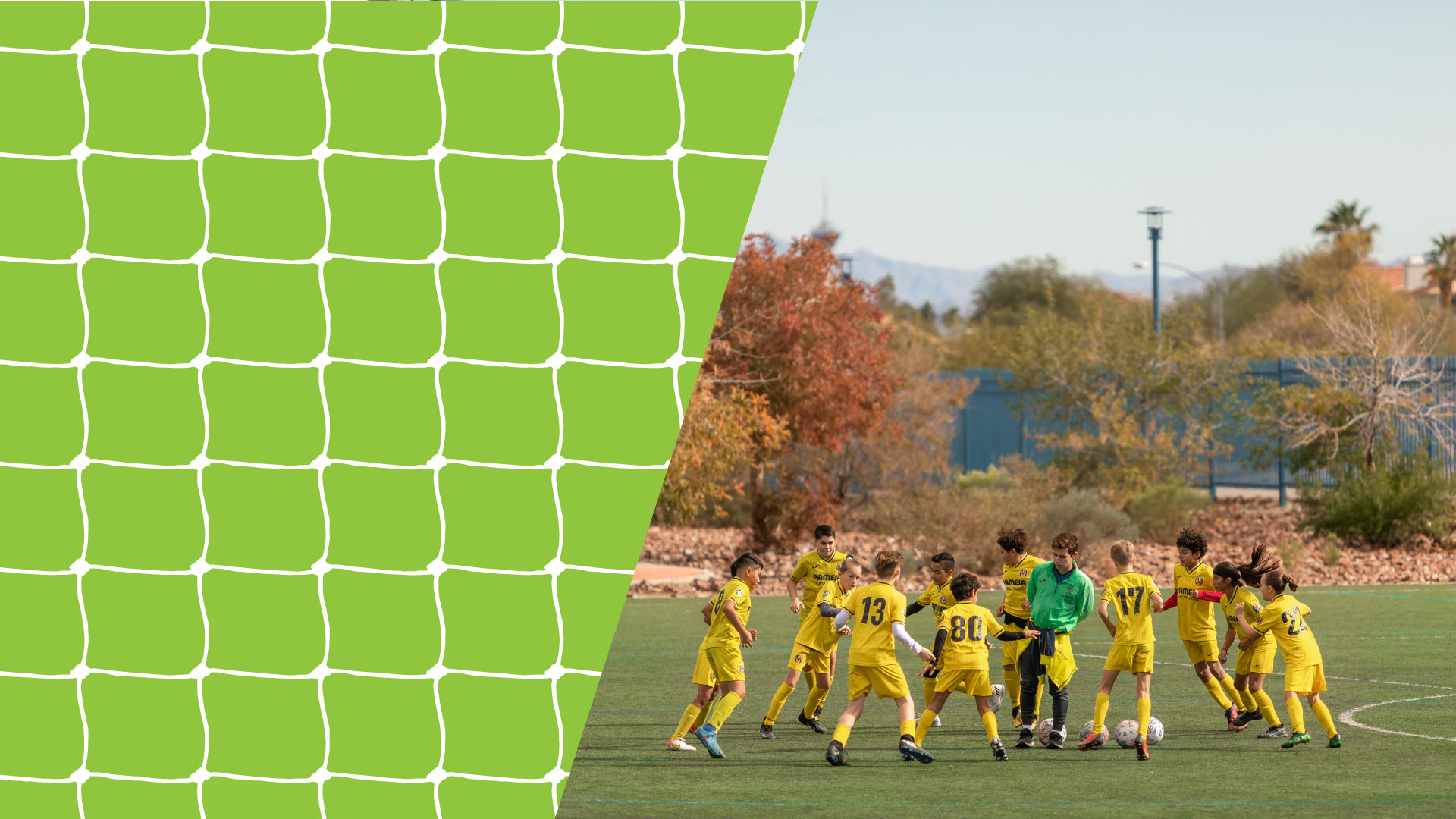
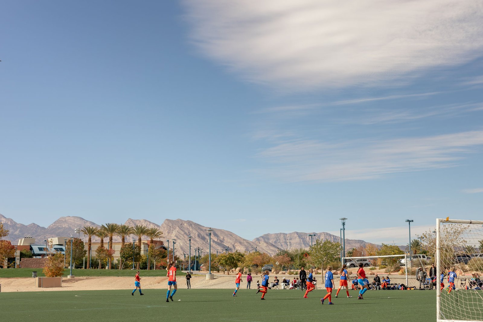
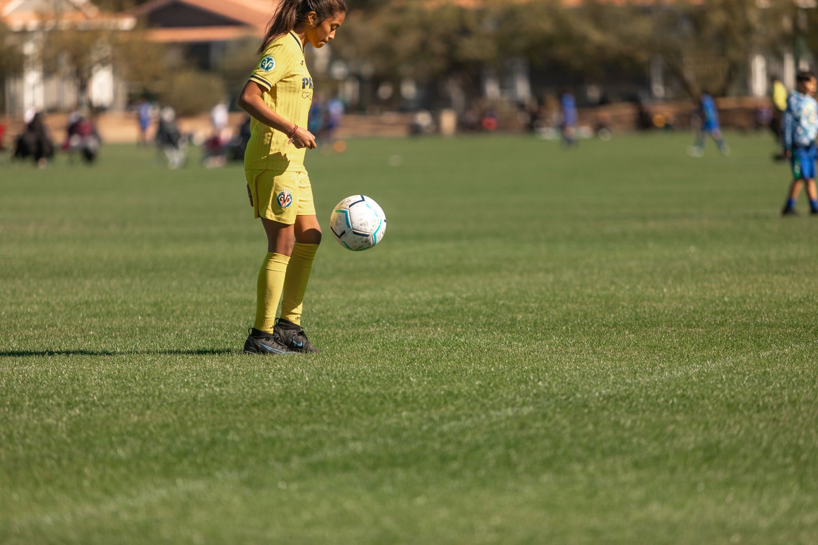
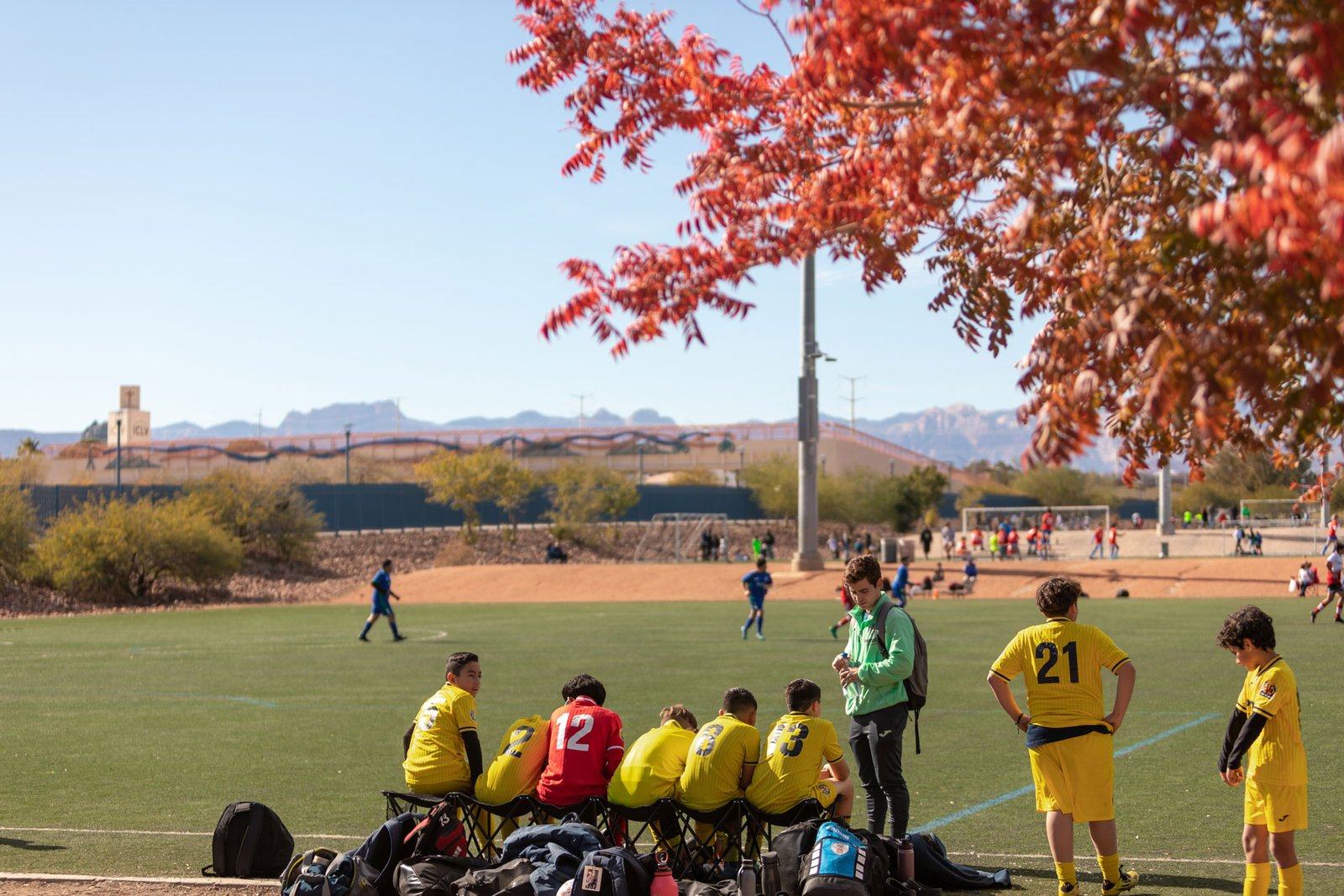
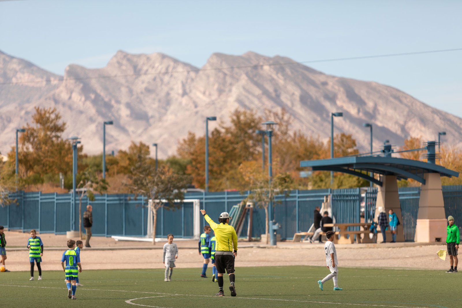
Photography
NYSA serves to inspire youth to play the sport of soccer. What better way to do this than with high quality photography of players in action?


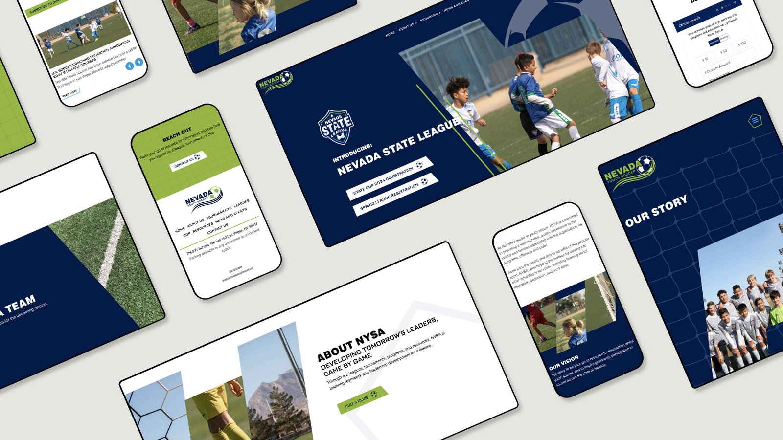
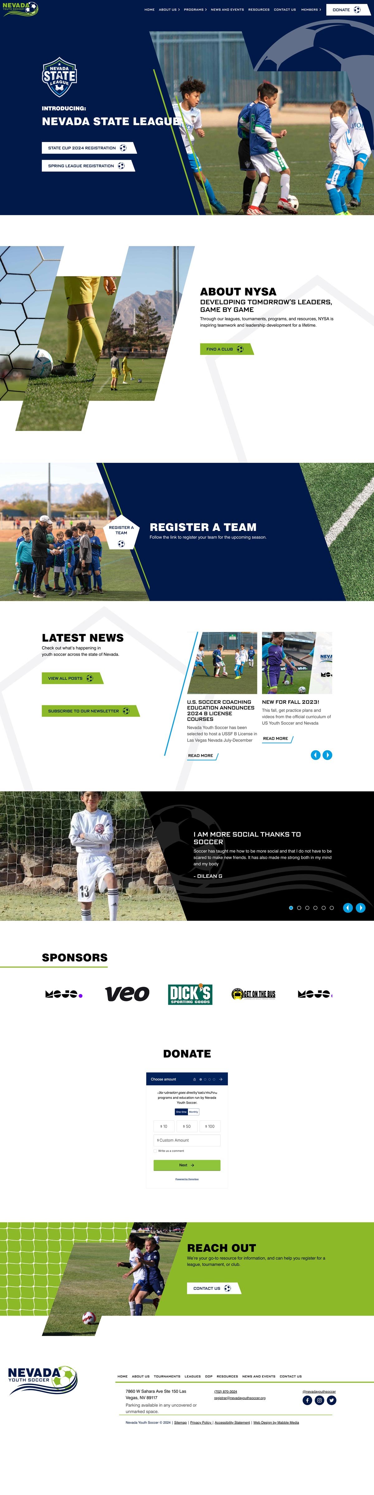
Web Design & Development
NYSA’s website is primarily for informational purposes—but there is a lot of information to convey. They also needed clear CTAs to register for leagues and tournaments. So we built them a large, branded WordPress site with great functionality and well-organized content.