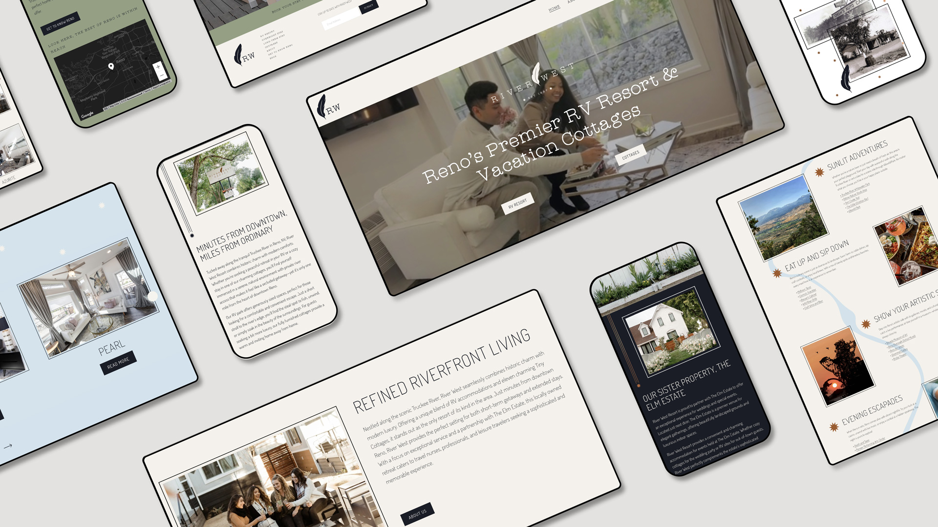
River West Resort
River West Resort is a premier RV resort and vacation cottage destination nestled along the scenic Truckee River in Reno, Nevada. The locally owned resort offers a unique blend of sophisticated RV accommodations and eleven charming tiny-home-style cottages, each named after precious gemstones. Located just one mile from downtown Reno, River West Resort combines historic charm with modern luxury, catering to travel nurses, professionals on assignment, and leisure travelers seeking both short-term getaways and extended stays. With high-end amenities, exceptional service, and a serene riverfront setting, the resort provides guests with a memorable retreat that balances convenience and tranquility.
Logo Design
River West came to us with a clear goal. Keep the spirit of the old riverside camp while elevating the experience for today’s guests. We leaned into a clean wordmark and a feather detail that feels like river breeze and handwritten notes, then supported it with simple placement rules so the logo is present but never loud. The restrained Copper texture is used as an accent, which keeps the system rustic and elegant at the same time. Quiet assets like the picture frame line, the rule inspired by vintage RV graphics, and the feather with a note card give the brand small moments of personality without clutter.
Brand Guide
We paired Catalina Typewriter for warmth and character with Dosis for easy reading, then defined type scales, contrast checks, and usage so layouts stay calm and clear. The palette and assets were documented with when and why notes, including a Copper accent that appears only as a tasteful detail. We also formalized the sub brands for Resort, Cottages, Park Models, and Storage so every message looks like it comes from one place. The result is a guide that feels like a day by the Truckee River and works just as well on a booking card as it does on the entrance sign.


"Refined Riverfront Living"
Messaging
The story of the property runs through the voice. We honor a legacy that began in 1927 and speak in a friendly, plain style that invites guests to slow down and stay awhile. Headlines focus on refined riverfront living and on being the best backyard in the city, while body copy keeps promises clear about stays, amenities, and location. Calls to action are direct and neighborly so guests know exactly how to plan a visit.

Photography
From the start, we agreed with the team that the place should sell itself. That meant natural light, real moments, and details that let people feel the water, trees, and texture of the property. We framed images with the brand picture line and paired select testimonials on the note card so words and visuals work together. The mix balances beauty shots of cottages and RV sites with people relaxing, gathering, and exploring, which keeps the story honest and welcoming.


Web Design & Development
River West asked for a site that felt calm and local yet made booking simple. We translated the guide into a fast experience with clear paths for RV Resort and Cottages, an About page, Reno tips, and a prominent Book a Stay button. The cottages follow the gem theme so guests can browse eleven unique stays like Tanzanite, Sapphire, and Pearl, and move into details with a single click. Type, color, and spacing follow the style guide so everything reads well on any device. The flow from discovery to reservation mirrors the property itself, simple, refined, and by the river.